


There is nothing that brushes my fur the wrong way like a poorly designed, obviously amateur cover. I mean honestly. Sometimes I look at a book and think, "Oh, darlin'. I might read that if it wasn't so ugly." Because even though everyone knows the old adage about "You can't judge a book by its cover", we all do. The cover of your book is how you're selling yourself because if you can't lure a reader over by the appearance of your book, you'll never get them to become captivated by your characters and story. And though the inside of the book (like the inside of a person) is the most important part, you're doing yourself no favors putting forth a dowdy or childish presentation. I was on Pinterest, pinning eye-catching covers, and I decided to search Self-Published book designs. I have seen cheesy professional covers, but if we are to be honest, the ugliest covers are found in the annals of self-published novels. I found this hypothetical cover...

...making a fun (and heart-wrenchingly ugly) poke at what The Hunger Games might have looked like if it was self-published. {Note to self: never use papyrus or bleeding cowboys fonts if you want to be taken seriously. }With this example, I set off to put together a post of covers that work and most definitely do not work, and to discuss the differences with you. Please note that I have read very few (if any) of these books and cannot tell you if they're any good or not. Also, my thoughts on the cover-design are not intended to slam the authors' taste, but to point out where it works and doesn't work for my own taste. Not every one of these books is self-published, so I am aware that they range in quality. Please don't get ruffled and shout things like, "WELL THEY COULD AFFORD A PROFESSIONAL!" I am interested in discussing composition.

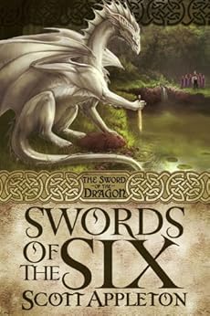
What doesn't work: The font. Everything is one font, one color, and aligned left. There was little to no imagination in the set-up of the text, and this immediately screams "SELF-PUBBER" to me.
How to fix it: Imagine this could be a pretty cool cover with a bit of tweaking as regards filters. This is pretty one-dimensional. Also, if the text was just cramped and blah, you could do something pretty cool with writing the title on the guy's palm instead of a ring. I think that would be a good use of your somewhat limited space, and a bit more interesting.

What doesn't work: Really, there isn't anything sticking out that makes me think, "ew". I could do with less face because like I said, I don't like the cheesiness of face shots (full-body shots are far worse) but since her eyes are dropped, it works. And I love the veil
How to fix it: Run with this cover far, far away from everyone else who will want it for their own. (Ahem. Meeee? Ahem.)
What doesn't work: Again, the font is horrifically monotonous. Not only is it all the same size and style, but the subtitle is rendered almost unreadable (it says "a tale of the Titanic) by the mirage-effect put on it. I am getting a headache from squinting at it right now.
How to fix it: When a book has nothing but a landscape-image on the front, I subconsciously assume its characters were too boring to make the cover. Or the personalities were too flat to occasion thought when the author went to make a cover. I know these authors were probably trying to go for the midnight desolation of a sinking-ship tragedy, but I'd request at least a teeny little row-boat bobbing along in a swath of moonlight to intensify the mood.

What works: I love this cover too. I love the ship in the background and the way we are seeing from behind the girl. I love the mood, and I most especially love the pop of crimson in her skirt to add life to an otherwise foggy cover. Also, I love the design along the bottom.
What doesn't work: It'd be nice to see a little more text. Maybe a subtitle or a quote from the book on the front because there's a bit of empty space up toward the top. Maybe that's purposeful, in which case leave it. All in all, I love this cover.
How to fix it: Add a bit of "what people are saying" or something at the top, or leave it as is. I like this cover.
What doesn't work: It's a bit duo-chromatic, being entirely green and brown respectively.
How to fix it: More color would be nice, (some purple or navy shadows in the lake?) but I'm liking the author's choice to keep it simple and effective. Well done.

What doesn't work: Umm...it doesn't really give you an idea of what the book is about, which leads me to believe it's a literary novel which, in its turn, reminds me of stuffy people on an airplane who only pick up a book when their iPhone battery dies. I like literary novels, but most people who read them are dull. This is probably a book about a girl in India who was abused or something and has a secret orchard where she keeps jars with all her bitterness toward these people written on scraps of papyrus, and this helps her learn forgiveness.
How to fix it: Well if it is a literary-novel then they've made their point and personally I like this cover a lot. If not, then the author/publisher needs to adjust their cover design to better portray the story.
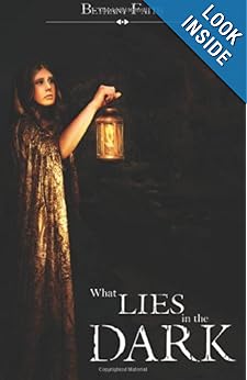
What doesn't work: There is too much dead-space in this cover. And since there's light being thrown back onto the girl from her lantern, I think there ought to be a faint glow on the rest of the cover. Also, a sure sign of being self-published is using your first and middle name only. (Bethany Faith) People in real life have last names, so real authors have last names unless you're Avi, in which case we can forgive you, or if you've otherwise stylized yourself for a specific reason. If you are one of those people who shy from revealing their identity, then by all means make up a pen-name. But give your alter-ego a last name because it just looks more professional.
How to fix it: Add a lantern-glow on the blackness. I get that the point is to make the book look dark (hence the name?) but a little glow never hurt anyone. I think the glow would fill up the blankness of the right side of the the cover. Also, get a last name. Truly, though, this is a pretty schnazzy self-pubbed cover and I actually think the book looks interesting and promising.

What doesn't work: Unlike the example above of Bethany Faith (thanks for your patience, Miss Faith. I'm sure you are a fine author and I tip my hat that you've actually got books in print), Michael E. Glasscock III has surrendered himself to forever being identified in my mind with P.G. Wodehouse characters.
How to fix it: Either he's aristocracy and thinks himself entitled to drawling on and on in the credits, or he ought to have chosen either a middle initial or the III. Having both seems pompous. Some people might also find the introduction of the purple tab up-top to be annoying. I rather like it, as it adds interest and lets you know that this is Book 2 of a series. But if it bothers your sensibilities, take it off.
Your thoughts? Do you agree with my observations of this sampling of covers? And how important is cover-design to you? Leave all your thoughts, mind-wanderings, and what-not in a comment below and I shall reply with promptness. I'd love to hear what you think are the most important (and/or bothersome) elements in the composition of a cover-design.


6 comments:
That last one is so pretty. I don't know about reading the book, but it makes me want to wear that dress and live in that town. :)
I think cover design is possibly even more important for self-pubbers than pros, because—what with people judging books by their covers the way they do—a professional-looking cover kind of gives you an extra stamp of legitimacy. That's why I wouldn't touch designing my own with a ten-foot pole. I just don't have the artistic and visual skills.
By the way, have you ever checked out the monthly Ebook Cover Design Awards at Joel Friedlander's blog The Book Designer? He picks a winner in fiction and nonfiction and gives critiques to a bunch of the rest. It's really helpful in learning to recognize what works and doesn't work and why.
Hmm... yes, I'd have to say I'm guilty of that. We all *do* judge books by their covers because we read first with our eyes and then with our souls (and yes, I'm aware that's a bad paraphrase based on the idea of eating, but I think the same principle applies).
Having a poorly designed cover has been probably one of my biggest fears going into self-publishing. I like iconic covers, covers that make an impact on you the moment you see them, in a good way, of course. Covers that just beg you to go beyond and read. They should tell you a lot about what the book is about, yet at the same time hold back enough information to make you hungry to discover more. I like what you said about all these books here, and I'd have to agree with you on pretty much every cover.
Elisabeth, I *haven't* checked out that website. I ought to - sounds wonderfully informative and helpful.
Kiri Liz, I feel the same way about self-publishing...that is really my one qualm. I don't want to be second-rate.
In defense of Bethany, I think I recall hearing her say that she chose to publish as "Bethany Faith" because she thought it sounded like a "first name, last name." In which case, from her perspective, she did choose a pen name -- that pen name just happened to be her first and middle name.
However, I completely agree about the lantern. That cover is far too dark.
If you'd like, I can send you an email about the quality of the book itself (assuming I could find out how to send you said email...).
Mark: I am more than willing to stand corrected, and since Bethany Faith chose her name with such considerations in mind then Huzzah! :) Thanks for the heads-up.
Also, anyone may get in touch with me via theinkpenauthoress(at)gmail(dot)com
Love this post! As a cover designer myself, I am constantly critiquing book covers in my head as a wander through the YA section at my library. A good cover is a statement, and it says "I care enough about the inside of this book to make it look good on the outside". And honestly, even if you're a self-publisher, a good cover artist isn't all that hard to find. Just as there are good indie authors, there are good indie artists. They may not be as professional as some of the traditional publishes, but they are a good sight of an improvement over the spoof Hunger Games cover. :P (and YES!! I'm not the only one who's noticed the Bleeding Cowboys fetish these days!!!!) Anyhow, thankyou for this post! It's a good reminder to me to keep my eyes peeled for inspiration when it comes to my own designing.
Post a Comment